Icons: less user friendly than you think
Icons can be treacherous. The world takes them as the essence of a friendly interface, so expectations are high; but they rarely work well. We have some advice about their design.
Icons are one of the great paradoxes of usability. The most familiar icons work well enough. The now ancient scissors icon for cut, and the glue bottle for paste, the trash can for delete, and the highlighter for, well, highlighting.
But outside these traditional areas, we see icons elsewhere failing in their main purpose. Designers want them to be minimalist visual representations of an action or option that take the place of ugly words or long menus. They expect users to understand them at first glance, pick them out quickly, or at the very least to learn them over the time. In practice, they often don’t work that way.
If you don’t believe it, you can prove it to yourself with two small observational experiments.
First, go to your nearest elevator and prepare to ride it up and down a couple of times. Make sure it has open door and close door buttons that look something like this:
The Close and Open buttons on Elevators work poorly despite being simple, commonplace, and easy to explain
Now’s the fun part, wait until someone has to press the Open Doors button – usually because someone is running for the doors. (You might have to precipitate that with a confederate who will run for the doors.) What you should notice is that a large proportion of people will struggle to figure out which button to press, and some will mistakenly press the Close Doors button. This is true even for people who use that elevator a lot and use those buttons a lot.
What you are seeing here is the failure of a familiar button with iconography that is, as far as visual design goes, simple and elegant. Everyone can explain their design, even people who have just struggled to pick the right one: the icons are simply arrows that show the direction you wish the doors to move. In theory, that’s the essence of good design, but it still doesn’t work, or work often enough.
The second observation is as close as your smart phone or computer screen. Have a look at the home screen. How many of the application icons now have as their most prominent element a letter or word indicating their name? Designers from some of the most prominent companies are acknowledging that small conceptual pictures often don’t work as well as old-fashioned initials and words.
App icons often use letters or whole words to supplement icons, in recognition of the limits of icon’s visual design
Should you give up on icons? Absolutely not. Users expect them, and well-designed icons used frequently by people who want to use them can be learned as a new sort of iconographic language. But it’s important to remember these two fundamental laws of icon design:
- Never force the user to rely on the icon’s visual design alone, especially if they are likely to be in a hurry.
- Icons are recognized more for their distinctiveness than for the meaning of their imagery. Make your icons distinct from each other.
Here are a few tips to help.
If you are designing icons in a field where there are already well-established icons, use them
It saves a lot of work for you, and even more so for you users.
Always include a name as well as an icon
And make the name localizable. Consider incorporating initials or words into the icon design.
Consider localization in your designs
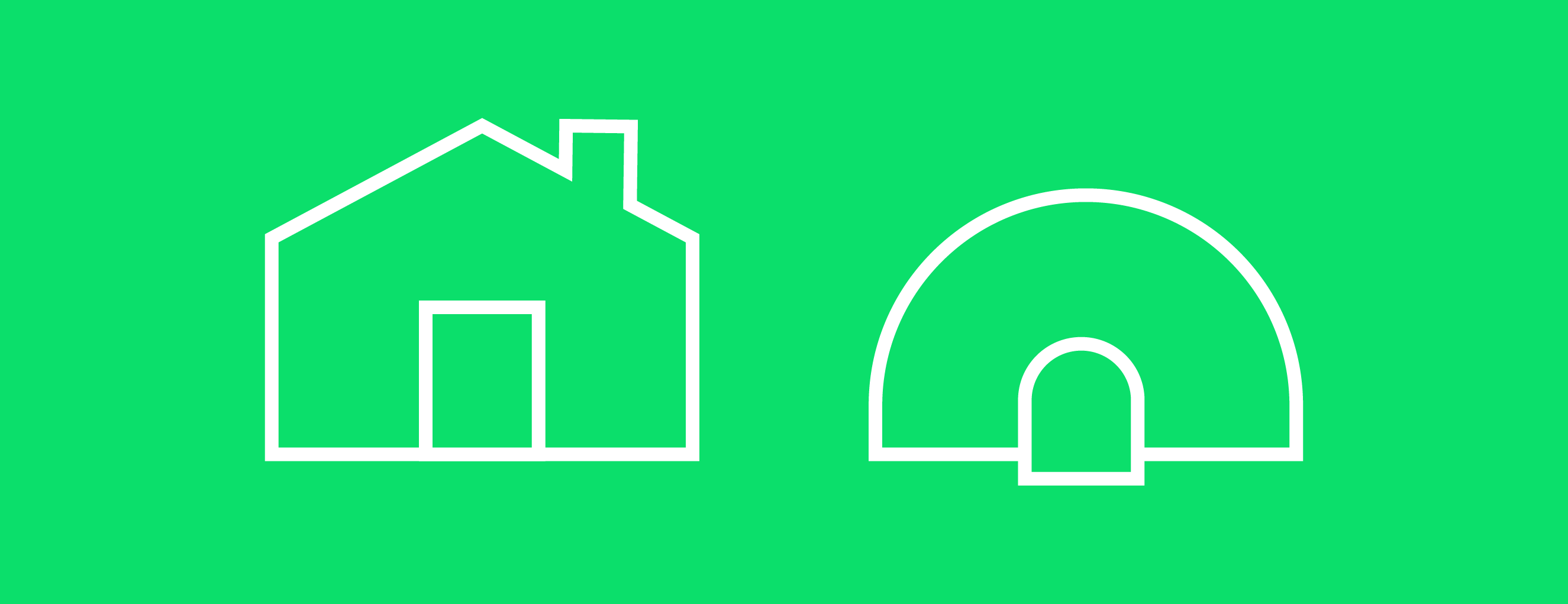
Many online icons are based on real-world counterparts, for example a mailbox represents email or a house represents the home screen. Beware however that these objects have different appearances in different countries. British homes have mail slots rather than US-style mailboxes. And in many parts of the world, houses do not have the straight peaked roofs that American homes have.
Homes come in different shapes around the world. Not many people live in Igloos, but if you did, it might change your expectation of a Home button design.
Similarly, technology sometimes makes real-world imagery unrecognizable to new generations.
The old-style rotary phone is not familiar to many youngsters, except as an icon (if that)!
It is reasonable to use icons for applications where expert users frequently have to select from large numbers tools. Even then it is helpful to follow the advice in this list of tips.
Test for distinctiveness
Because users select icons based on distinctiveness, make sure your tools are as distinct from each other as possible. A good test for distinctiveness that you can do on your own is to put all your icons on one screen and use a Photoshop-style tool to blur them all by 3-5 pixels. See whether you can pick them out quickly.
The blur test shows these toolbar icons may not be sufficiently distinctive to pick out quickly by design.
Words plus icons are best in emergencies
Don’t use icons alone for safety-critical applications, even when those icons are standardized.
Similarly, don’t use icons alone for any application that does not have an Undo function, as users often learn them by experimenting. We once saw a user break down in tears when he pressed a button to see what it did and it erased a train track he had spent an hour designing. We must admit that user was only six years old.
Test important icon sets with real users
If the icon is recognized instantly the first time, that’s a big win, but it’s rare. More often, what you’re aiming for is a test to show that it can be figured out with experimentation, and then remembered after an interval. If it can’t be remembered 5 minutes after it’s been learned, it’s probably not going to work. If you can design a real-world way to test this, that’s ideal. If not, you can have people learn the icons briefly as a flash card game, then distract them with another task, and then give them a timed test to see which icons they remember.
Follow the same rules for print
Sometimes icons appear in print rather than on screen, whether in a report, a map, or signage. The same general rule applies for these icons – except for a handful of very familiar universal icons (for restrooms and wheelchair access, for example), icons are not well recognized on their own. If the icons appear on a map, you have one advantage. You can include a key of their meanings in a corner of the map, so you don’t have to repeat the text on every appearance of the icon.
Andrew Swartz
VP, Head of Design Research
Sutherland Labs
Andrew Swartz
VP, Head of Design Research
“Brand, customer experience, financial goals, and technology – it’s easy to get any one or two right, but making them something harmonious, that’s beautiful.” Andrew’s career grew up alongside the UX field, and he has a deep sense of how to make the components work together. With a degree from Yale University, 8 years at Apple, and 16 more in research, Andrew is an enthusiastic and seasoned researcher – not to mention avid hill walker and cat lover.