Making the BBC News website more accessible
To enhance the research deliverables for an accessibility project, which explored the accessibility of the BBC News website, we produced a set of wireframes to illustrate research recommendations.
The research
Our research team conducted a user research study which explored participant reactions to the BBC News Front Page from an accessibility perspective. The purpose of the study was to explore how participants of assistive technology use the BBC News front page and to see if they came across any issues when browsing and interacting with it.
Participants recruited consisted of those with visual, cognitive, auditory and motor impairments. All participants used assistive technologies to aid their use of the page during their session. The research took place at Sutherland Labs’ studios and in participants’ homes. We interviewed 12 users with disabilities over 90 minute one-to-one sessions.
Key Insights
Participants all had very different needs, also due to the software used to navigate the page. Layout, hierarchy and amount of content were the main issues for most users. Layout was perceived as cluttered and the amount of content overwhelming in many instances. Moreover the order of certain sections wasn’t very well understood. For blind users using screen readers the page structure and hierarchy of information is vital. Font size and contrast were also issues for quite a few users.
Proposed design
Based on the research insights, our design team made some design suggestions and created wireframes to best illustrate the proposed changes to make the content more accessible.
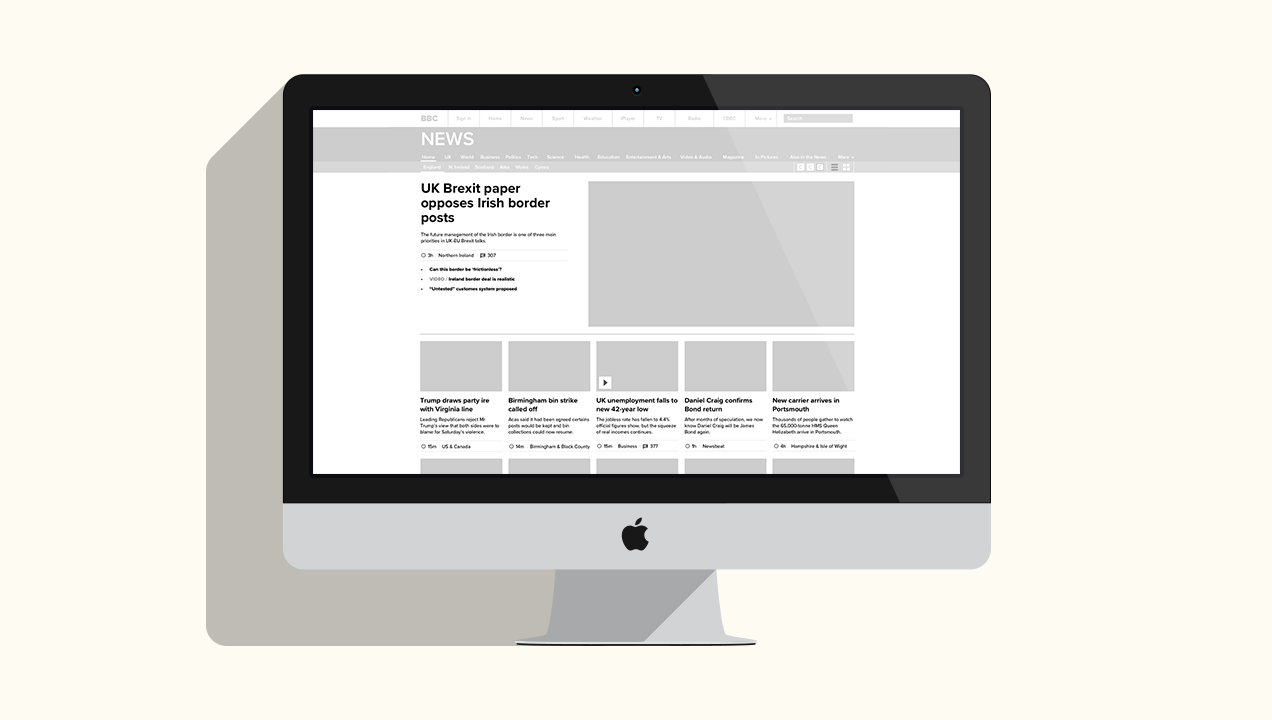
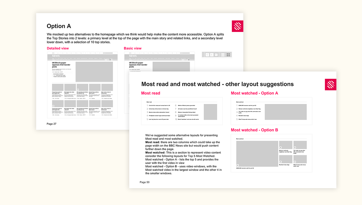
Option A splits the Top Stories into 2 levels: a primary level at the top of the page with the main story and related links, and a secondary level lower down, with a selection of 10 top stories.
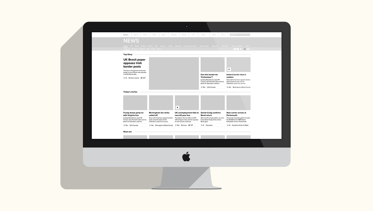
Option B shows a reduced amount of Top Stories as a whole. The top section of the page features the main story and related links (showcased as tile elements rather than inline text), and is clearly labelled like the other sections of the page, “Top Story”. Beneath the main story, there is a smaller selection of other stories, which we labelled as “Today’s Stories”. In this version the content is much more compact allowing the Must See section to peek above the page fold.
We suggested having a way to switch between a detailed view and a basic view without the synopsis, as some users felt that the amount of text was overwhelming.
We also thought that the colours and contrast could be switched in a similar way to http://www.bbc.co.uk/accessibility/#
Other changes proposed revolved around clearly labelling video content, and simplifying the most read and most watched sections for a better understanding of the order to follow.