Reimagining an IT support & ticketing system
In order to better serve the needs of Sutherland employees, Sutherland IT wanted to understand the user experience of its key tools and processes, including their recently introduced ServiceNow help ticket portal.
With regard to ServiceNow, Sutherland IT had observed that many service tickets were mistakenly submitted under wrong category headings – that is, users were mixing up reporting issues (e.g., a broken device) with requesting services (e.g., software update). This resulted in more work for the IT support team, who needed to sort tickets into correct categories in the back-end. Confusion when entering tickets, and longer resolution times, also resulted in poor experiences for Sutherland employees.
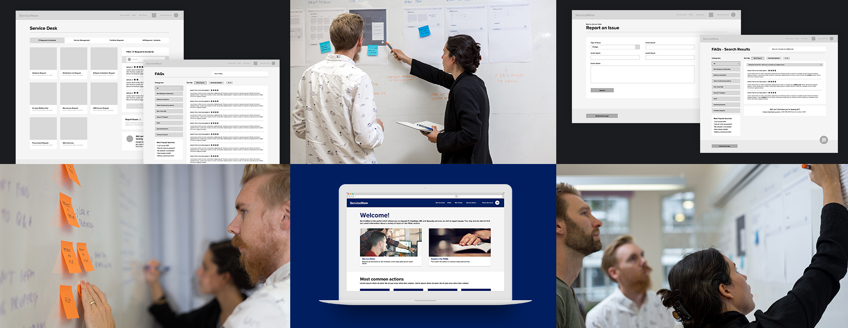
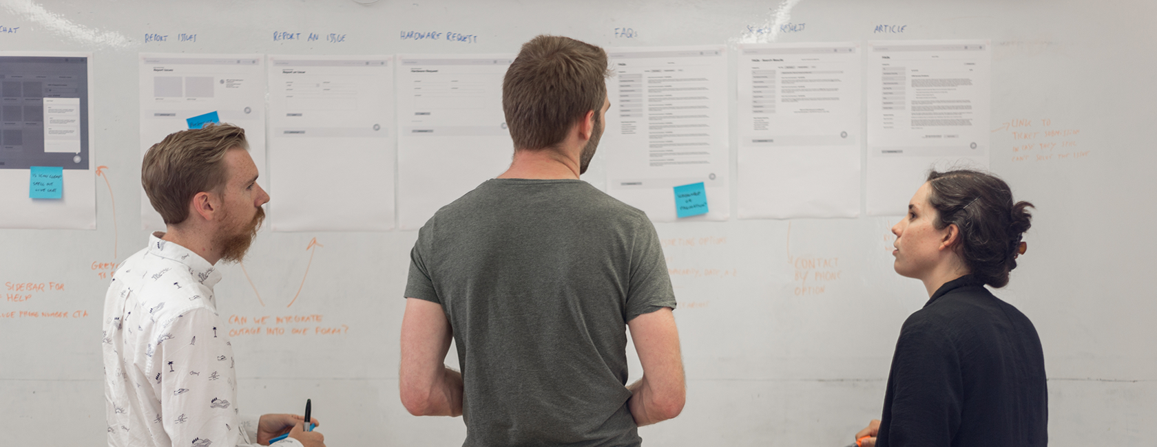
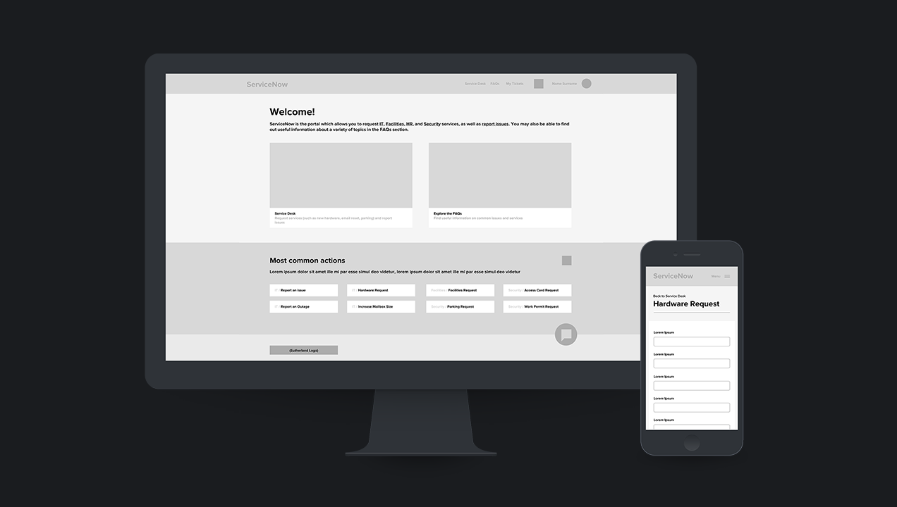
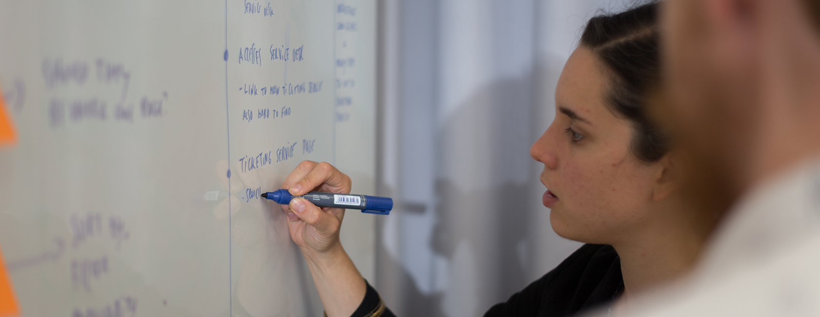
To improve the usability of IT tools at Sutherland, we conducted user experience research to uncover employee perceptions, then created wireframe prototypes to illustrate our recommended redesign of key screens along with initial UI design suggestions.
The Research
Sutherland Labs invited Sutherland employees who are Director level and above to take part in an online survey. A subset of survey respondents was selected to participate in a more in-depth remote interview. 27 employees submitted survey responses. 8 employees completed 1 hr, remote interviews.
The survey and interview both covered topics around employee onboarding with regard to IT, as well as ServiceNow.
Key Insights
We found onboarding to be an integrated, but inconsistent experience. With regards to IT, some received their hardware with a “warm handoff”, others received “a few pages” of printed explanation but no personal walk-through, and some received no instruction at all.
With IT onboarding varying widely across employees in terms of content and thoroughness, many employees sought a consistent, centralized source of information for all things IT. Without access to an official, centralized information source, employees turned to personal contacts.
Past onboarding, participants described one or multiple negative experiences around the effectiveness of IT support. Issues included long handle times, language and other communication barriers, poor knowledgeability, and lack of clarity around point of contact. Participants with low trust in the effectiveness of IT hesitated to reach out, and instead attempted to self-solve issues as much as possible.
Proposed Design
It was apparent to us that Sutherland employees needed one, easy to access, simple to understand resource. A single source of truth for IT.
It was also difficult to differentiate between the many terminologies and technical jargon used across the system. Our focus was to improve the overall user experience and create a clear and concise page flow, whilst redefining technical jargon to simple, helpful language.
We ensured to clearly distinguish between IT issues and services, matching the urgency of a problem to the proper channel, instilling confidence in the users. We also redesigned the knowledge base area of ServiceNow to be a hub for self-help articles which easily linked back to support tickets should employees encounter any unfixable problems.
Finally, we made several recommendations, post project, on things like providing speedy solutions through automation and user interface design.