Taking Our Own Medicine – Redesigning The Sutherland Labs Website
After going through a rebrand process in early 2016 we thought it only fair to have our new website centre stage. Ever the optimist, we started off with the problems….what’s not working and why? What can we do better? How can we use our website to reflect what we do and how we work?
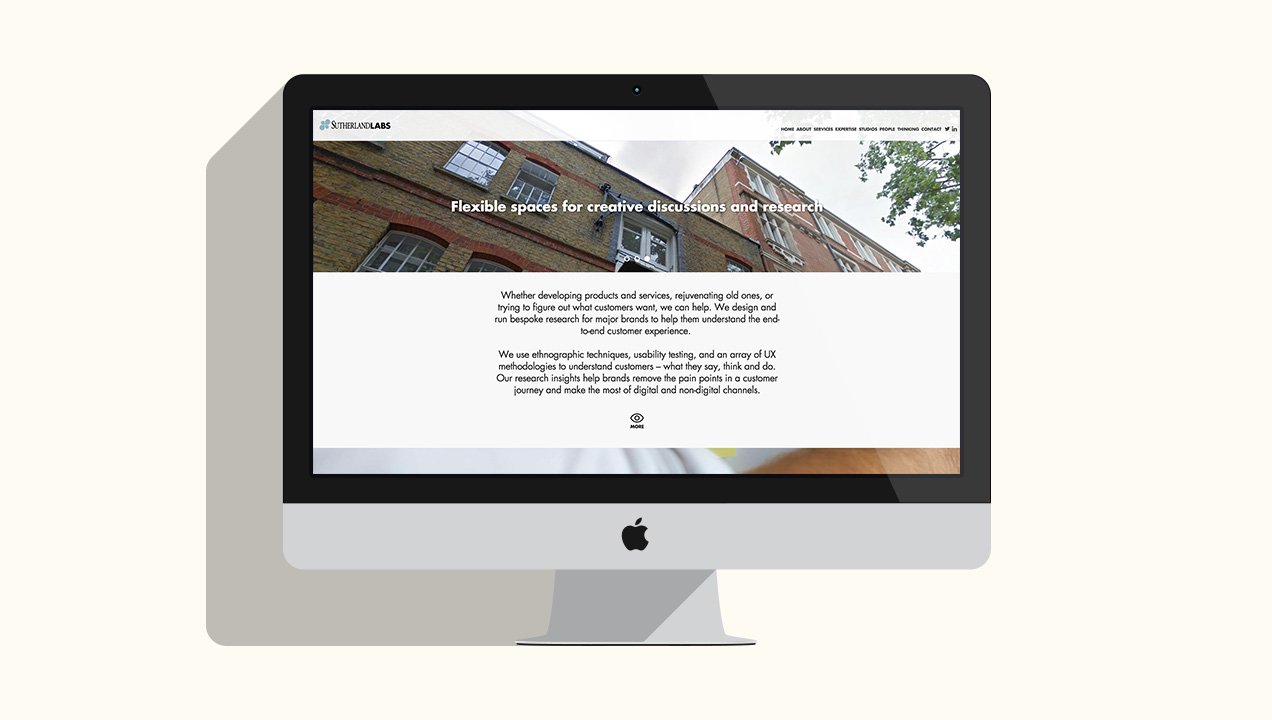
Old Sutherland Labs Website Design
A few key problems were immediately apparent to us. The old navigation was complicated and a culmination of many requirements and trying to please everyone so nothing stood out. We had inconsistent pages and styling with clunky typography and oversized images. The site was also not reflective of our team or environment.
All in all we knew we’d need to start from scratch to build a coherent experience for our users to easily understand, and what better way to put into practice our team of researchers and designers to create something truly great.
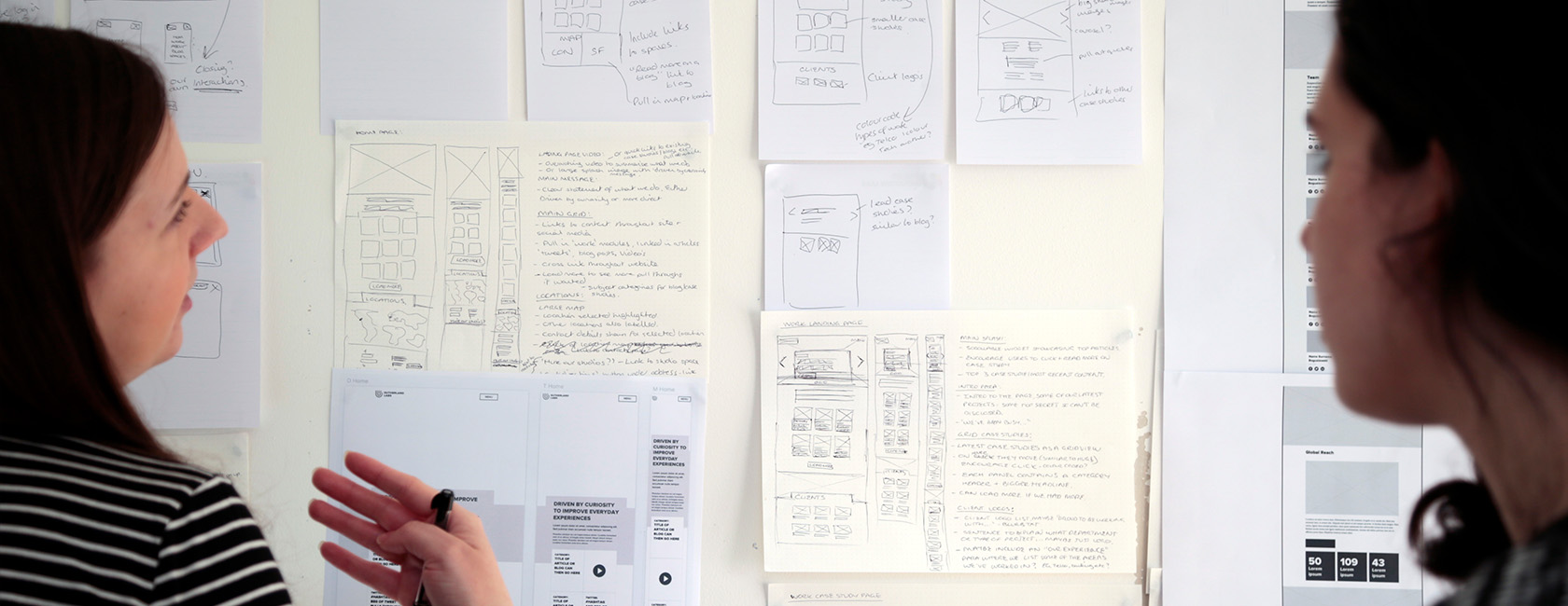
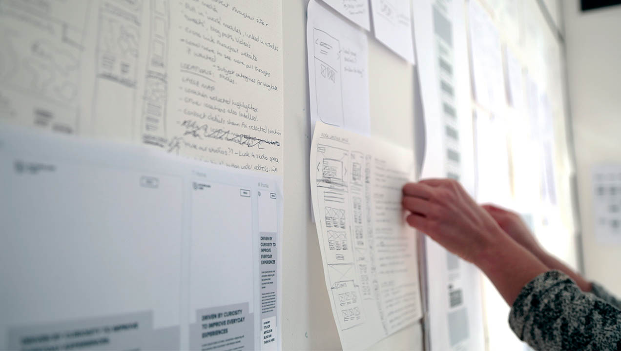
The research
We conducted stakeholder and prospect client interviews alongside competitor analysis. Gathering insights and feedback before any design was kicked off. Personas and user journeys were created, helping us to inform the top features of our navigation.
Key Insights
Users were finding content to be too wordy and jargon heavy. They needed punchy and concise sentences about what we do and who we are. We were also advised to avoid being sector specific and to focus on our values you guys bring is the learning from daily customer’s behaviour and interaction with multiple brands, products, services and technologies. Our test users disliked too many content transitions and parallax effects, and struggled to see anything with low contrast.
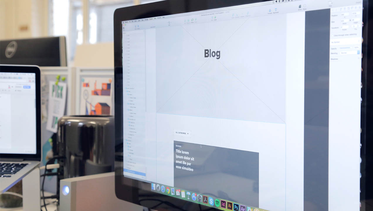
Proposed Design
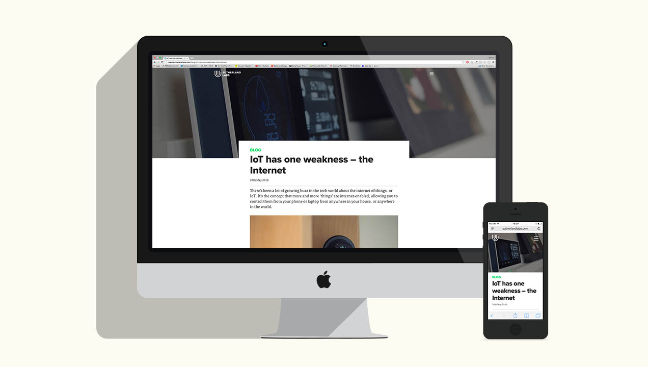
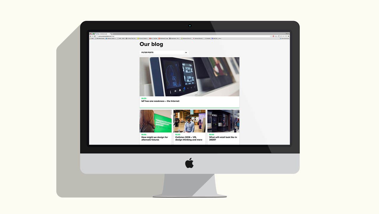
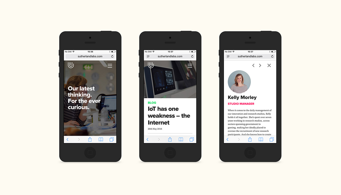
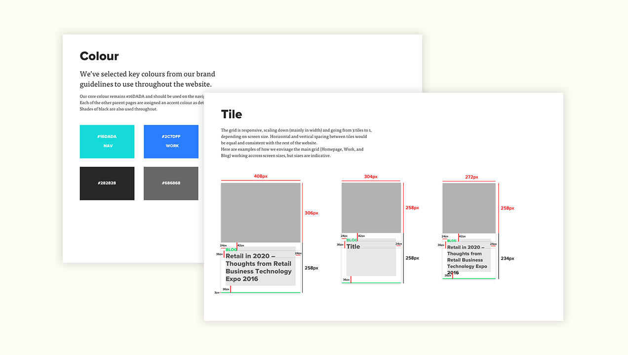
Our research gave us the perfect structure to build our new design around. We made sure the images we used were research focused and featured people which our visitors can relate with. We structured our content around a grid-layout that serviced to always provided our latest content in an easy to access format, and based the navigation around our findings from tests conducted with Treejack.