Design that Inspires: Passport Renewal
It has been a long-held convention that the public sector moves far more sluggishly than the private one – struggling with outdated technology and systems while private enterprise dashes forward into the future. No wonder I was dreading applying to renew my passport. I was having flashbacks to the seemingly endless reams of paper that you had to collect from the post-office and fill in. The overpriced photobooths that produced a tiny picture that your GP then had to sign the back of to certify it was really you. The months long wait to find out if you had failed to tick the correct box somewhere in the multitude of forms and had to start over again.
Luckily there had been a few changes since my last time around, the gov.uk websites have seen a complete overhaul and systems have been put into place that allow you to manage a lot of the minutia of government correspondence pretty easily.
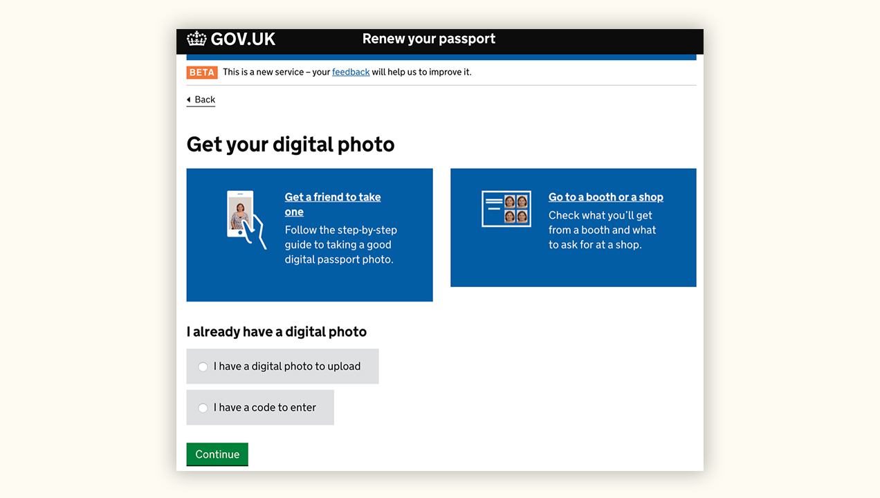
The process itself was surprisingly simple, you completed the webforms, uploaded an appropriate digital photograph and then confirmed your identity. This could still have been an arduous and confusing process for many of the service’s potential users, but the website had been designed in such a way as to provide you with constant guidance at every stage in the process, with any information that wasn’t already clearly displayed upfront being just a click away.
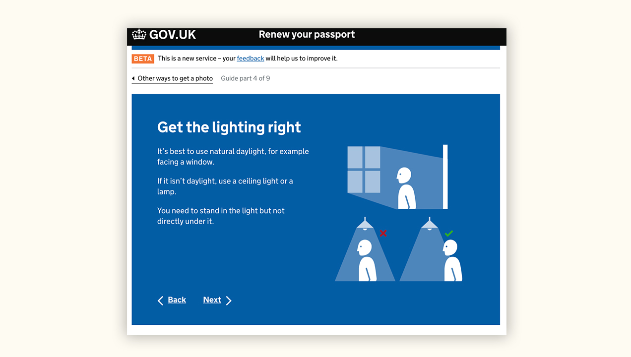
Everything from where the required information could be found to the best way to position yourself in appropriate lighting for your photograph was explained in careful detail, with pictures to make understanding even easier. Exceeding my expectations even further, there was a video available to walk you through every stage of the process.
It would have been very easy for the designers to do the bare minimum; to make a functional website that would have let people apply to renew their passports and then move on, but instead thought was given to how the process could be made easier and more accessible and the design was centred on the end user.
What really struck me after I had finished applying for my renewal was the difference between my expected and actual levels of stress. There are so many parts of the public-sector experience that could be improved with this level of commitment to design thinking.
That was when the inspiration really kicked in. The NHS could use a system like this to allow people to book their hospital appointments, to renew their prescriptions and to synchronize with local pharmacies to arrange delivery of medications. The Job Centre could use a streamlined service like this to guide people towards roles that might suit their skills, and to help them manage their appointments and benefits.
There is so much potential in this one website that it has made me realize just how many of the issues that people experience with other parts of the public sector could be readily resolved by a change in design focus.
The Labs Team