Design that Inspires: Edward Tufte and The Visual Display of Quantitative information
Edward Tufte’s book, The Visual Display of Quantitative Information is one of the most important books on design that I’ve ever read. Not just because of its contents, but because the object itself is the pinnacle of information design in the book format.
Tufte is primarily known as a statistician, although he started his academic career in political science. He is recognized most frequently for his professorship at Yale and pioneering the field of data visualization. Throughout the late 70s, he compiled the information for The Visual Display of Quantitative Information while lecturing at Princeton University alongside the renowned John Tukey, another fore-runner to the field of information design.
Tufte was well known for being a perfectionist. He has frequently pressed back against the trend towards aesthetics’ prominence over function in graphic design, so it should come as no surprise that he struggled to find a publisher for the book that could meet his exacting standards. After years of bouncing back and forth between the big five publishers, Tufte realized that none of them were ever going to accommodate the quality levels that he demanded. With no other options, he took out a second mortgage on his house and self-published the book himself, working closely with the graphic artist Howard Gralla to ensure that every line was exactly where he wanted it to be.
EJ Marey's train schedule, Paris to Lyons, featured on the front cover of Edward Tufte's work, The Visual Display of Quantitative Information
What could have been a tragic plunge into hubris by a well-respected man instead turned into an absolute triumph. The book was a massive commercial success and soon gained traction in the academic world as the core text for the subject. It also allowed Tufte to migrate from his original role in political science to working as an information expert full-time.
In addition to two hundred and fifty different graphics, illustrating the best (and worst) practices in information design, the book is also filled with concise explanations of every element of those designs, why Tufte judges them superior to other similar designs, and the core design principles that guide that judgement.
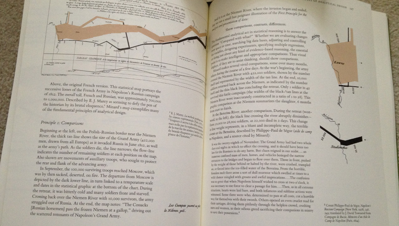
Tufte includes within the book a graphic of Napolean’s march to and from Moscow.
Just holding the book in your hand and flicking through the pages is enough to convey just how much meticulous effort went into every part of it, but for a perfectionist like Tufte, it was never enough. With a design thinking mindset, he created iteration after iteration of the book. Offering up its contents for peer review and making minor adjustments throughout its print run. The first edition sold out its massive print runs seventeen times over the course of its life, and each time that a new printing came out, more of Tufte’s corrections and tweaks had been integrated. A second edition of the book has now been released, incorporating all of the corrections made in the previous seventeen re-releases and, inevitably, a few more changes to keep the book in line with modern thinking on the subject.
Whichever version of the book you manage to get your hands on will probably be judged imperfect by its creator but speaking as someone who is only reading the thing instead of trying to pick it apart at the seams, The Visual Display of Quantitative Information is one of the most inspirational books on design that I have ever come across, and just having it on my shelf is a reminder of all the ways that we, as designers, can do better.
Owen Daly‑Jones
SVP, Head of Insight & Design
Sutherland Labs
Owen Daly‑Jones
SVP, Head of Insight & Design
Trained psychologist and anthropologist, interaction designer, product designer and Fellow of the Royal Society of Arts: there are many strings to Owen’s bow. His endless fascination with human behavior and 25 years in the industry make him ideally placed to advise our clients on everything from service propositions to digital transformation. Owen inspires and leads our global design group and creative teams, also serving as non-executive director on various startups and advisory committees.