The UX of Kiosks
The humble kiosk may be one of the most commonly used, and commonly overlooked tools in UX Design. But after years of helping clients in retail, financial, and customer service industries to introduce them it has become pretty clear that there are some ground rules that you need to follow if you expect them to be useful.
At the first glance, kiosks look like a tempting solution to a number of retail and customer service problems. There is a low upfront cost and then a pittance to pay for maintenance compared to the wages of a full-time staff member. Unfortunately, it is rarely that simple. Dropping a kiosk into an environment without careful consideration almost always results in it being utterly ignored.
Customers fear kiosks as a possible source of frustration or embarrassment and don’t change behaviours unless guided to the new kiosk-oriented behavior; and either incentivized to use it, or discouraged from using the old system.
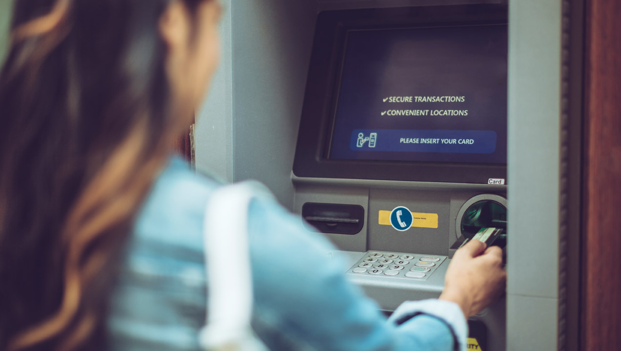
A classic example of this is the ATM, which is after all only a specialized sort of kiosk. Designed to provide a less expensive alternative to the bank teller, these kiosks saw large-scale resistance during normal opening hours when people could use the familiar human tellers at the branch. After hours? The only game in town, a huge incentive. When banks decided to accelerate ATM adoption, they punished users by making it less convenient to use tellers with longer and longer queues. Eventually the behavior changed.

Kiosks are usually introduced to replace an existing function within an environment, rather than to introduce a new one, but often intervention by staff is required to manage the transition. As you are trying to guide users through the shift from one behavior to another, you can end up needing more staff than you started with to help direct the users to the kiosk and train them in their use.
Once a certain tipping point of user volume has been reached, even new users will adopt normal queuing behaviour and learn to navigate the kiosk UI themselves, but early adopters need guidance to get the whole system flowing correctly. If users feel that they are being observed and do not yet know how the kiosk functions then they become flustered and abandon the kiosk in favour of the familiar, so the placement of kiosks at the early stages of the transition can be vital to avoid them feeling like they are “on the spot.”
When McDonalds introduced self-service ordering touch screens recently, there was resistance from many of their visitors and even when these kiosks were being used, it was inefficient because the users had not learned how to navigate the UI. Over time regular customers became adept, and able to modify their meals to suit their preferences in a way that they may have been embarrassed to do when faced with another human being on the other side of the counter.
Many are looking to smartphone apps to replace kiosks in the modern UX environment, but while most of the functions of a kiosk can be mimicked or even surpassed by a mobile application, there are other barriers created. Some people happily hoard as many apps as possible on their devices, but others are extremely picky about which ones they invite into their life. There is a certain intimacy to apps for many users that just isn’t there with the kiosk. The average user needs to surpass a certain threshold of use for a service before they are willing to install an app, perhaps once a week or more.
Another consideration is scalability. Too many kiosk designers do not consider work-rates. If the action being undertaken at the kiosk takes a minute then the kiosk is capable of serving at most 60 users an hour. Often customers are less efficient at conducting tasks than employees are, and backlogs can result. Making tasks efficient and easy to reduce error rates makes kiosks more viable.
Over the years, we have seen generations of kiosks sit unused, gathering dust, and taking up valuable retail space. To ensure your kiosks are useful, consider deeper research into the behaviors of your potential users. Find the designs and tasks that will ease their load, offer them new opportunities, and free your employees to provide higher value services.
